


The Problem
After examining the market place of food-related apps, I found there was a lack of curated restaurant content in the digital space. I saw an opportunity to take my love and passion for pizza, and build an app for devoted fans of this food. Users of this app would be able to find the best pizza in their city instantly.

My Role
I was the sole creator from concept to completion. I performed all research, user interviews, user testing, persona development, visual design and prototype design. The tools I used included Illustrator, Photoshop, Sketch and InVision.
Research
I conducted a competitive analysis by evaluating an array of general food apps, pizza focused apps, food blogs, and websites. I looked outside the food industry to see what other digital spaces my demographic connected with. I found my audience most connected with more vibrant, clean, and minimalist digital experiences.
User Interviews
I used a group of four paid participants that fit my target market. The group enjoyed cooking, eating and exploring the restaurant scene. They were also frequent smartphone app users. I performed the interviews using a scripted list of questions based on ideas from my research. I recorded and took notes from our sessions. I gained insight into their pain points using similar apps on the market.

USER RESEARCH AND INTERVIEW FINDINGS
Photos
I discovered users found online food photos to be hard to gauge. Irrelevant photo results would also confuse their decision making.
Reviews
The users also had trouble believing online food reviews. The consensus was that reviews were too varied and clouded judgement. They were also concerned that mainly angry people feel the need to review, while happy customers might not bother. The possibility of review fabrication also was a factor.
Travel
Users wished for a better way to find great restaurants when traveling to new cities.
Filter
They enjoy a way to filter their choices whether it be by location, price, rating, etc. In existing comparison sites, users were unable to filter preferences, or found the features too complex to navigate.
Lists
Some users keep lists of restaurants they want to try. Others like to ask friends for recommendations. Both groups wished for a streamlined way to keep track of food lists.
Simplicity in design
Users wanted a more clear, simple and quick way to find restaurant information. Most felt current sites offered info in outdated and confusing ways.
Passions
Users are more passionate about some food and drinks then others. Some of the standout categories included: coffee, wine, beer, pizza, desserts and donuts.
Insider Info
Users enjoyed hearing special tips given for restaurants.

PERSONAS
The interviews I performed led me to understand who might be the ideal users of my app. I created the three below personas to represent these users.

The Traveler
Lives to travel and experience new things.
Does research for her trips on the internet.
Activities, hostels, restaurants and yoga are her main focuses.
When traveling solo to unknown places, trusted reviews and photos are important to her.

The Foodie Couple
They live in an Urban environment and love to explore the culinary scene.
With busy work lives, they have little time to cook.
Having developed a high bar for restaurants, they want to make sure they spend their money on great food.
They keep extensive lists of places they have liked and others they want to try.

The Urban Highschool Boy
Could eat pizza every day.
Budget conscience.
Likes to take girls out to eat for dates.
Has all the hottest new apps and is constantly on his phone.
SKETCHES
Through the sketching process, I used information gathered in the user research and interviews to start planning the features the app would contain. Also how the app would be visually designed and flow.

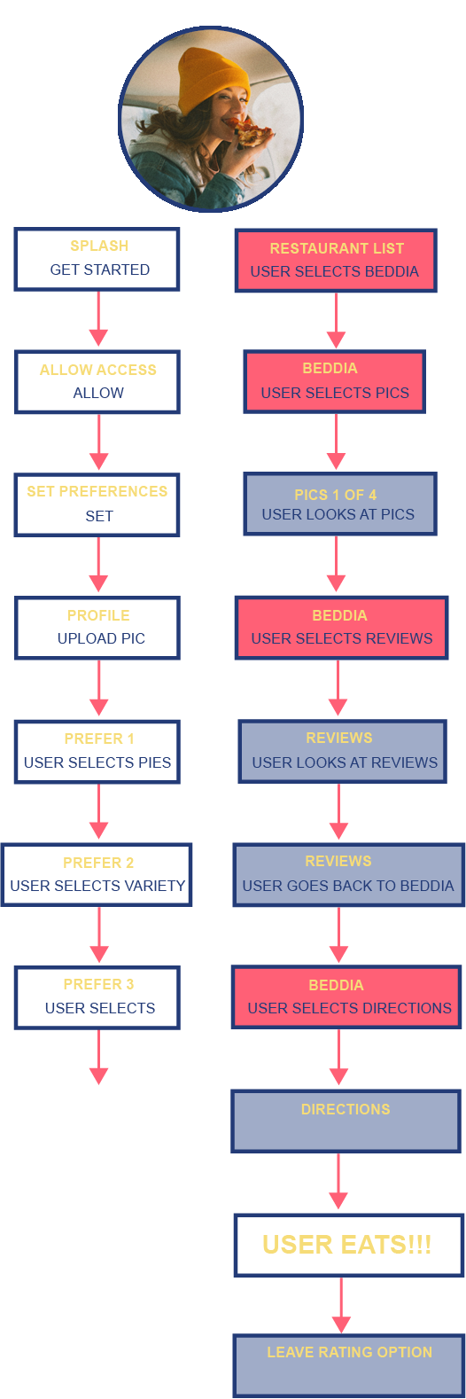
USER FLOW
This user flow showcases the journey of “The Traveler” persona.

USER TESTING - ROUGH PROTOTYPE
From the user testing sessions I discovered the following areas to improve:
Remove the pizza oven type information as well as the toppings choices feature to make things more simple.
Change the image of the crust I drew to be more recognizable.
Don’t add in google reviews, take them out to make more specialized user reviews only.
Don’t show the restaurant details such as hours and address, they can access that on google or the restaurants websites.
Not necessary to show the type of atmosphere.
Learned how to best describe sauce, cheese and crust preferences.
Don’t include the full menu.
Do not include diet restrictions.
Design to combine all sauce, cheese and crust preferences on one page.

VISUAL DESIGN / UI
My research indicated the target audiences responded to:
Immersive experiences.
Bright and bold imagery.
Minimalism.
App name and logo
I polled seven names to my target audience. Pizza Crush was the overwhelming winner.
Icon Design
Color and Font
I chose atypical pizza colors to showcase the playful nature of the app. The fonts were chosen to have a clean and easy to read look.


MID-FI PROTOTYPE
Provides users all the pizzas in their selected cities.
Filters the pizzas through a variety of categories including; slice or pie, budget and distance.
Gives users the choice to see curated photos and reviews from Pizza Crush members.
Archives the pizzas that members have tried or wish to try.
Allows users to follow and share with other Pizza Crush members.